01
Orbitra
Orbitra is a space travel app which offers unique once in a lifetime experiences. It serves as a platform for space enthusiasts to find and get ready for those missions which suit them the most. It also helps its target to connect with other users, ensuring a more human and enjoyable experience.
Role:
UX/UI Designer
Industry:
Space Travels
Duration:
4 weeks
Challenges
Feature Integration: The app main function is to serve as a hub to explore and track the user’s upcoming missions. The challenge was to integrate a small selection of virtual and interactive resources all designed to help the user prepare and enjoy their safe travels even before boarding time.
Enhance the Space Travel Experience: Provide real-time tracking of spacecraft and offer interactive visualizations of flight paths and destinations.
Educate and Inspire: Serve as a learning platform for users to understand astronomy and space history. Gamify space knowledge and provide AR sky maps.
Enable Mission Planning and Coordination: Offer scheduling tools and resource planning for space missions. Integrate communication platforms for mission teams and support staff.
My Approach
Discovery Phase
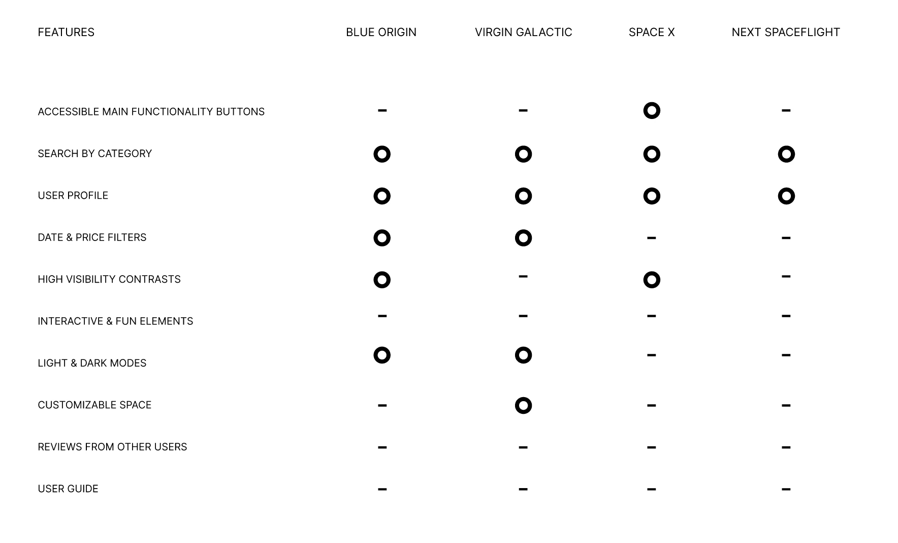
Competitor Analysis: As benchmarking I sorted out the strenghts and weaknesses from other competitive dgital products. This helps me decide which features will be in the final product and which won’t.
Market Analysis: Researched competitors and current trends in Space Travel apps and sites to identify key features and design elements.
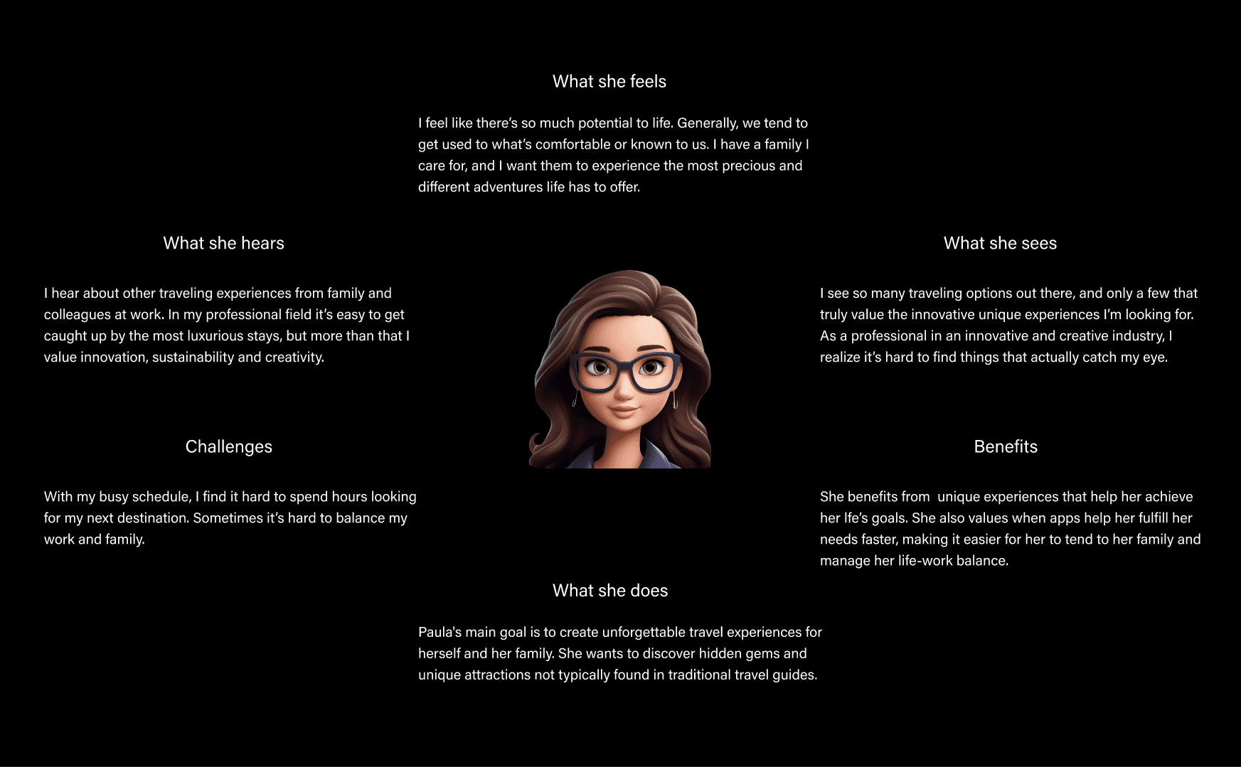
User Analysis: Crafted a user persona who values innovation and unconventional experiences. I further explored their
Design and Development
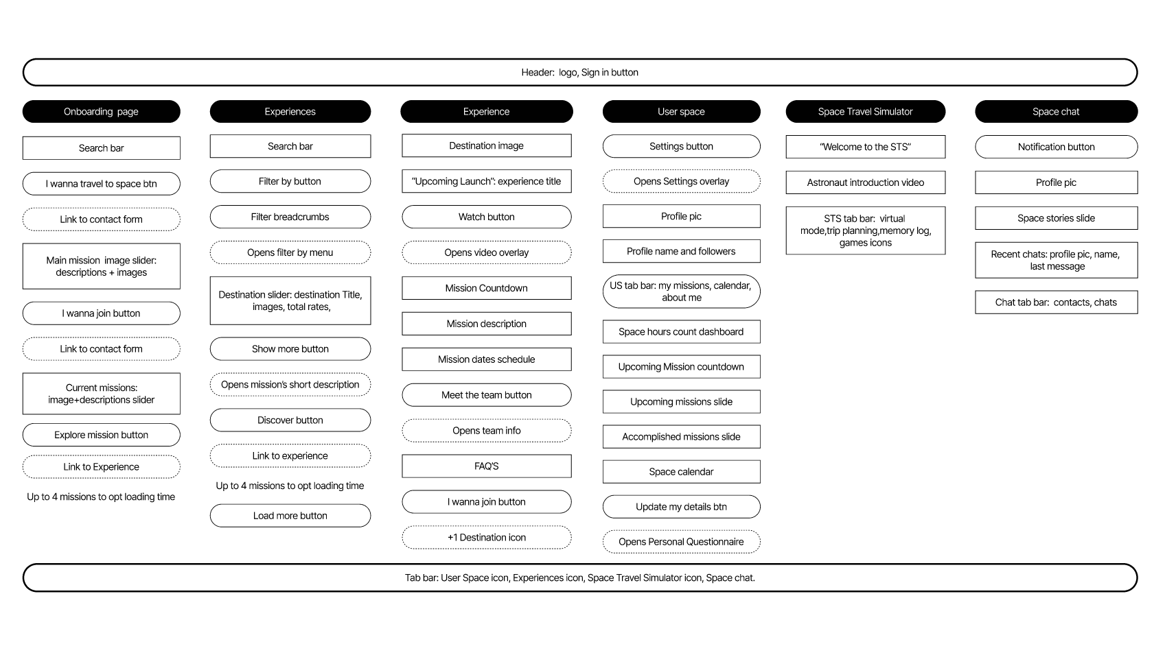
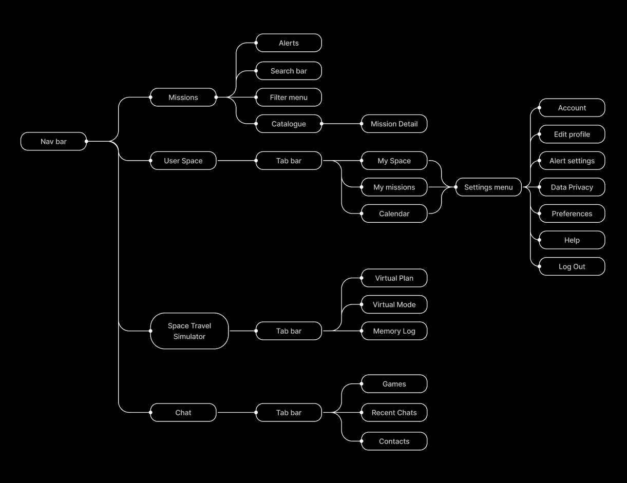
Sitemap & Information Chart: Designed a first sitemap to introduce all the content layers which will be included in the app, and followed Information chart for a more visual first draft.
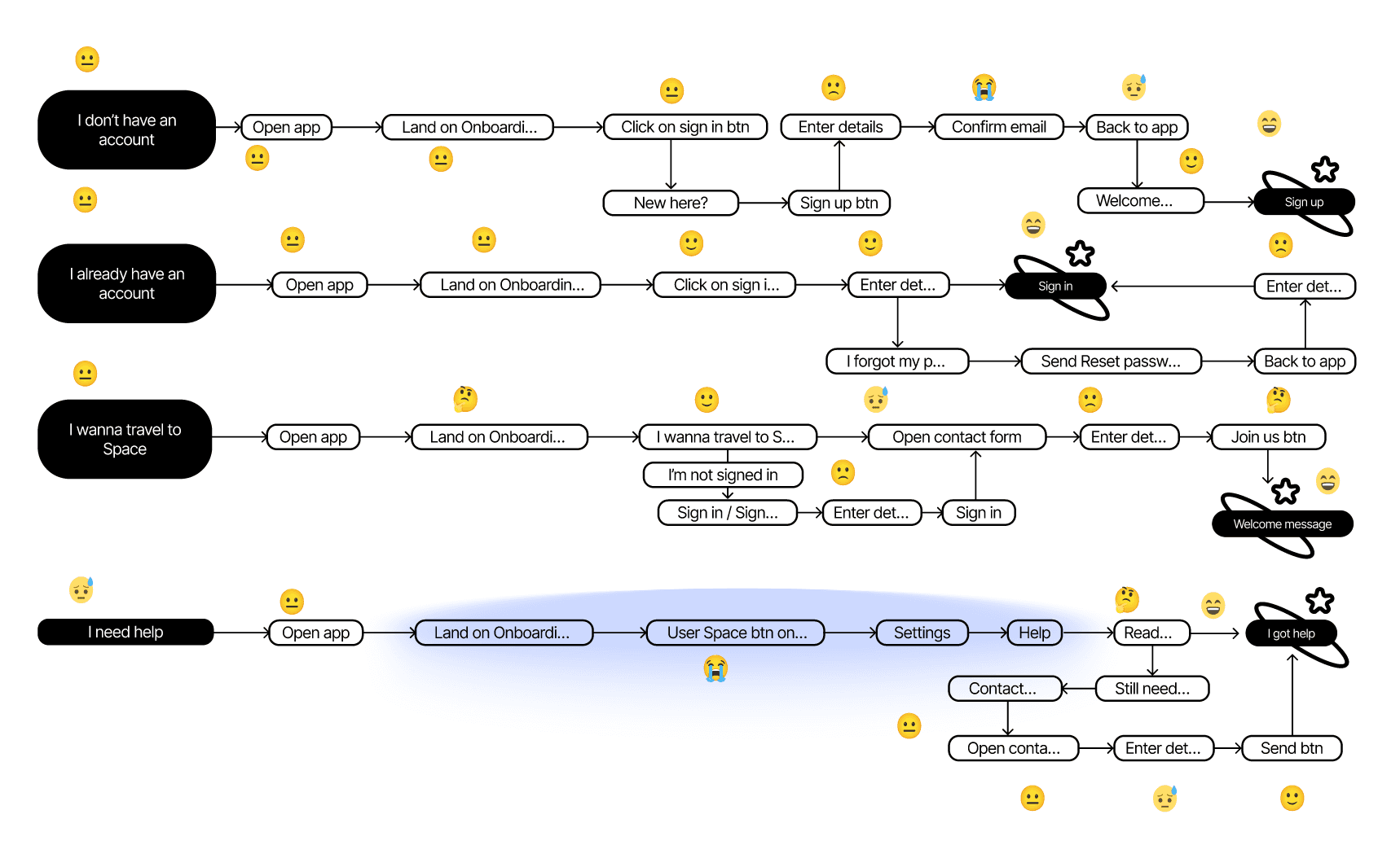
First User Flows: Tracked the user's first flows when accessing the app and pointed out their emotional touchpoints.
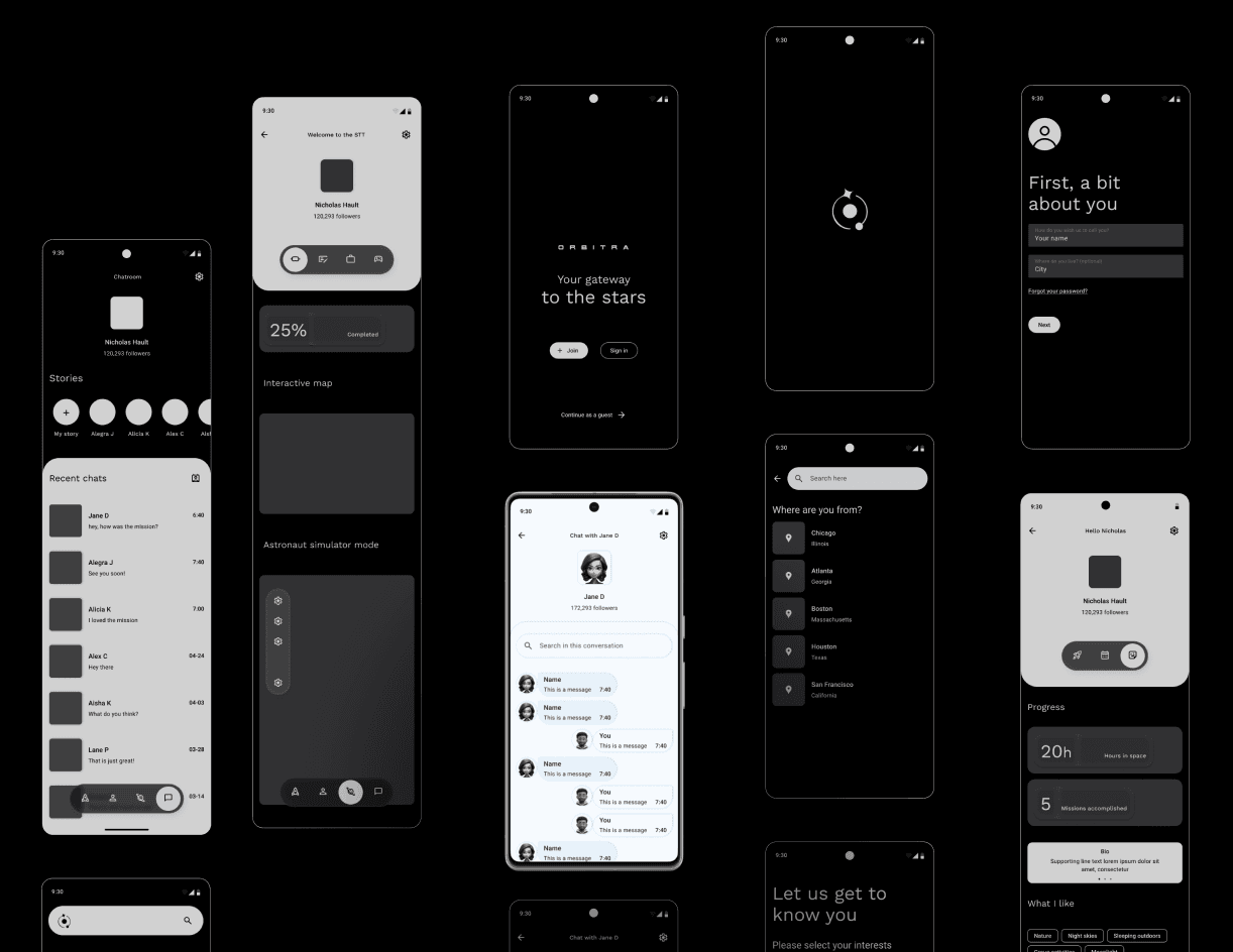
Mid-fi Wireframes: Built and relied upon a set of wireframes to help me picture the visual aspects of the app. This also gives me a mid-fidelity model to test the workflows and spot any flaws that may appear on the actual design.
Prototype & Final UI: Followed the UI guidelines from the Material 3 Design Kit Library and also applied some of its components.
Testing and Iteration
User Testing: Conducted usability testing with potential customers to gather feedback and refine the user interface and overall experience.
Results
The Protoype was completed to meet the requirements of the casestudy. It includes a proper integration of unique features, all meant to offer the user an innovative experience. Nevertheless, it lacks a real world testing with real users.
Future Plans
Continuous Improvement: Plan regular updates and enhancements to introduce new features and improve user experience based on feedback and evolving trends.
Expansion: Explore partnerships with other space travel-related services and technologies to provide a more comprehensive and integrated user experience.
Conclusion
Through strategic planning and a meticulous design native to Google, I delivered an MVP which would be expected to succeed in a real life scenario.